
Project Name: NPO Period Kits
Date/Grade/Class: Spring 2023, Senior, Design Studio 3
Project Description: Working as three or four-person groups, your assignment is to create a design package for your non-profit organization. After meeting with your NPO and getting feedback, each group is responsible for designing a typographic and design system for the package. Each group’s system must be flexible enough for our team of designers to work as they develop their assets. The entire package must be unified.
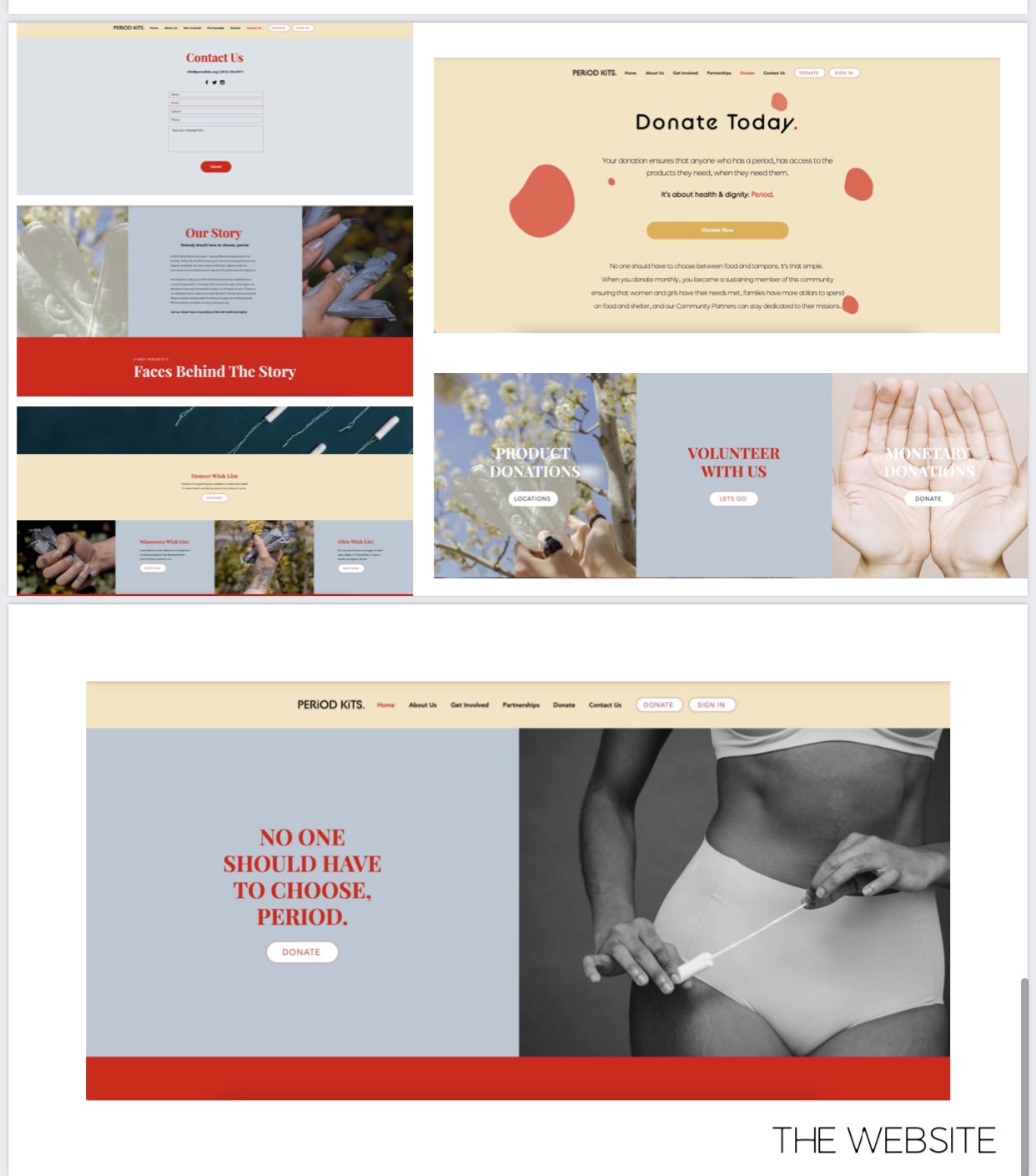
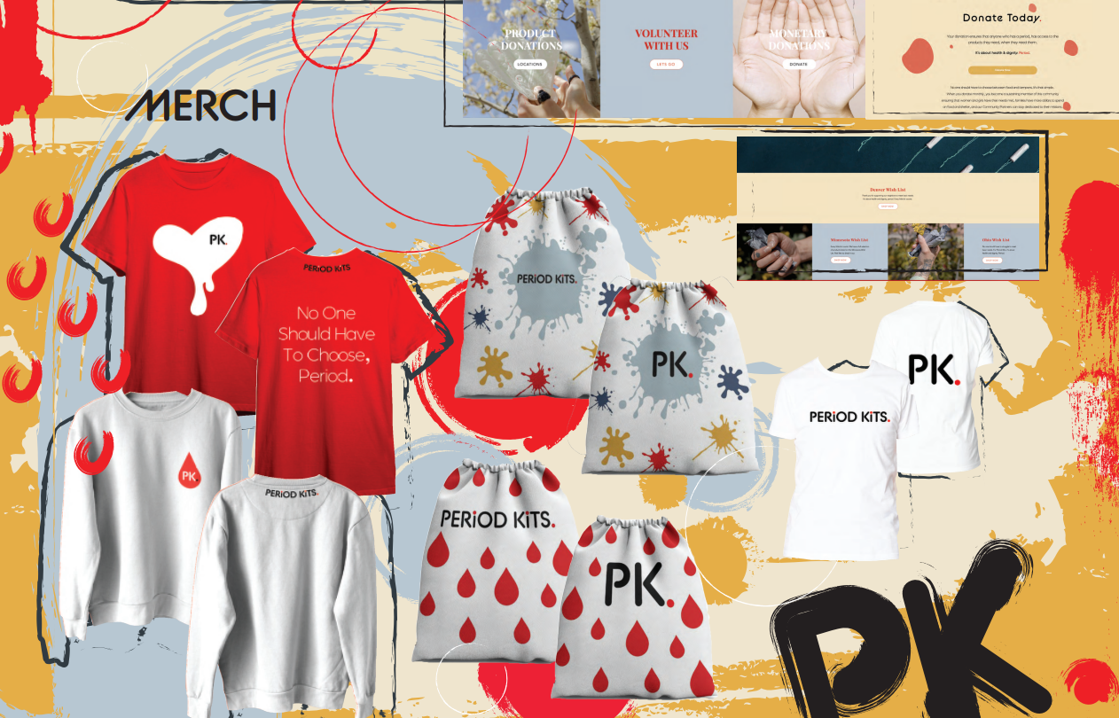
Thought process/Research: Period Kits requested a new website with new imagery as well as many print materials such as posters, social media posts, t-shirts, and a product pouch to hold the period products they give out to those in need. In my group, I was responsible for editing and rebuilding the website as well as making the t-shirts and product pouches, and the final poster.

Project Name: Designing Brand
Date/Grade/Class: Spring 2021, Design Studio 2, Junior
Project Description: Utilize principles of StoryBrand, empathy, brand positioning, and differentiation to either re-brand, create a brand, or expand the brand and design two touchpoints for an existing local company.
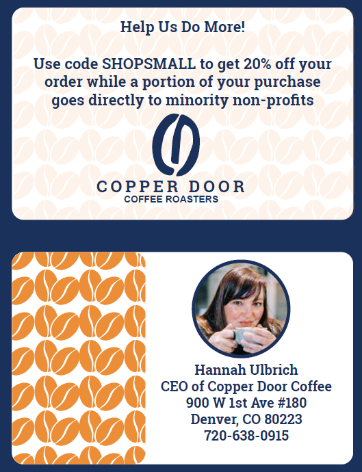
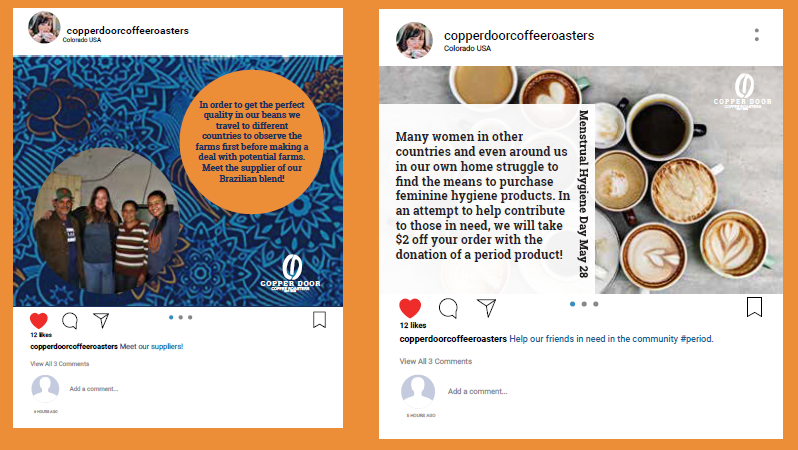
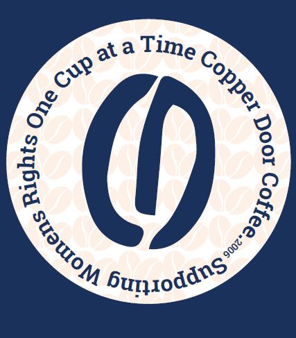
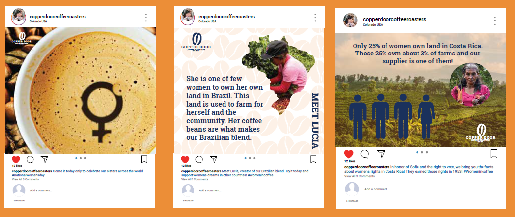
Thought process/Research: I decided I would expand a brand for this project. I picked Copper Door Coffee Roasters because I had gone in and gotten some of the best coffee, and the workers were extremely nice. After doing some initial research, I found that Hannah, the owner, is woman-owned and woman-supported. I thought I could use the skills I have learned to create fictitious print materials that would match the vibe Copper Door exemplifies. For the thank you card I designed, I included the farmer the beans came from so that consumers knew when buying Copper Door Coffee that they would be playing a major role in someone else’s life other than the company owner. Additionally, this thank you note helps others be reminded to be inclusive to others and encourage diversity, which is very prominent today. The thank you card creates positive interactions by leaving a lasting impression on those who buy their coffee, authenticity by helping show how much Copper Door cares about those in need, trust, and loyalty in knowing that your money goes to a good cause while you receive a great product. I also designed a few social media posts and a coupon for the brand to help sell more coffee and again get the word out that they are woman-owned, woman-supported, and a trustworthy company.

Project Description: This custom deck of playing cards is a unique creation tailored for a ranked and competitive Virtual Reality (VR) VTOL aviation server community. The design reflects the dynamic and immersive nature of the virtual aviation experience, integrating elements that highlight the server’s focus on precision flying, teamwork, and strategic skill. Each card in the deck is meticulously crafted with distinct color schemes and visual motifs to represent various in-game ranks, teams, and achievements within the server. The traditional suits are replaced with custom icons of aircraft, jets, and other aviation symbols, enhancing the thematic cohesion of the set. The face cards and jokers showcase different notable pilots and squad leaders from the server, while the numbered cards feature call signs, squad emblems, and competitive teammates. This deck not only serves as a tribute to the high-flying antics and achievements of the server members but also as a symbol of camaraderie and the shared passion for virtual aerial combat. Ideal for server events, celebrations, or as a collector’s item, this custom deck is a testament to the creativity and dedication of the VR VTOL aviation community. It celebrates the spirit of friendly competition and the art of virtual aviation mastery, making it a standout piece for any enthusiast or player.
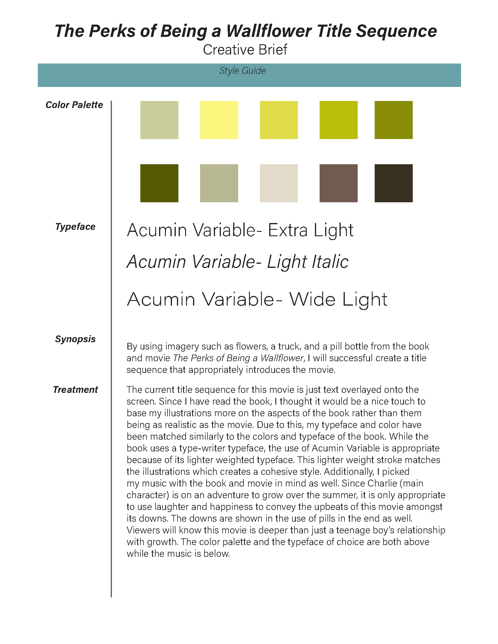
Project Name: Home by DreamWorks Title Introduction
Date/Grade/Class: 3D Motion Design–Fall 2021, Junior
Size/Length:15 seconds–450 frames
Project Description: Using tutorials completed in class, you are tasked to create a title introduction in Cinema 4D.
Thought Process/Research: Home, a Dreamworks movie, captures aliens’ life on earth as Oh meets human Tip. This movie, made for families, uses a kid-friendly animation style with lots of colors and fun shapes. In my title sequence, I will use similar color patterns and shapes to help create a title sequence that goes with the movie. Additionally, I will use the character. Oh, and the use of floors and skies in Cinema 4D to achieve the poppy earth look that I believe shows the in-between. In my sequence, the title will be spelled out using the cloner tool and several simulation tags; once spelled, Oh will appear along with credit to DreamWorks. The use of 3D space will be used to create a living scene on earth, complete with clouds, buildings, and color that reflects the approach the movie has created. I will add sounds such as wind, and alien space sounds to help create a well-rounded title sequence for the movie Home. Finally, I will be using the Typeface Bowlby from the movie.
Tape Running Time: The running time for this project is 15 seconds, 450 frames.
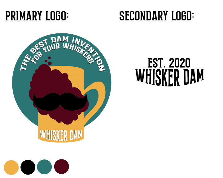

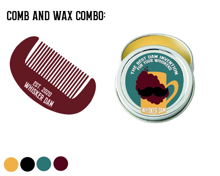
Project Name: Branding: Value is in the Eye of the Beholder
Date/Grade/Class: Spring 2021, Design Studio 2, Junior
Project Description: We were tasked to take a mundane object and begin to brand this object to create a different meaning and lasting image of the brand we built. We were required to create a brand strategy and identity for the mundane object in such a way that made our new brand different from those on the market, memorable, trusted, and popular amongst consumers. Building this brand required us to create touchpoints, also known as selling points, and our logo. We were to create a new meaning for the object by building our identity while paying close attention to the seven-story brand principles.
Thought process/Research: For my mundane object I chose a whisker dam, a metal piece that clips onto cups in order to keep beer foam out of men’s beards. My brand identity was focused on keeping men clean and fresh after enjoying their drinks which is why the touchpoints, which provide sophistication and grooming afterward, were successful. I wanted the logo to be pictorial with a few words; that way, the brand would be able to build much more than just a buyer-seller relationship but create mutual support through the use of their logo on things they could sell, like the flask or even t-shirts. After working a lot with the logo, I decided it was best to have a primary and a secondary logo. The secondary logo would be reserved for smaller items like the comb.
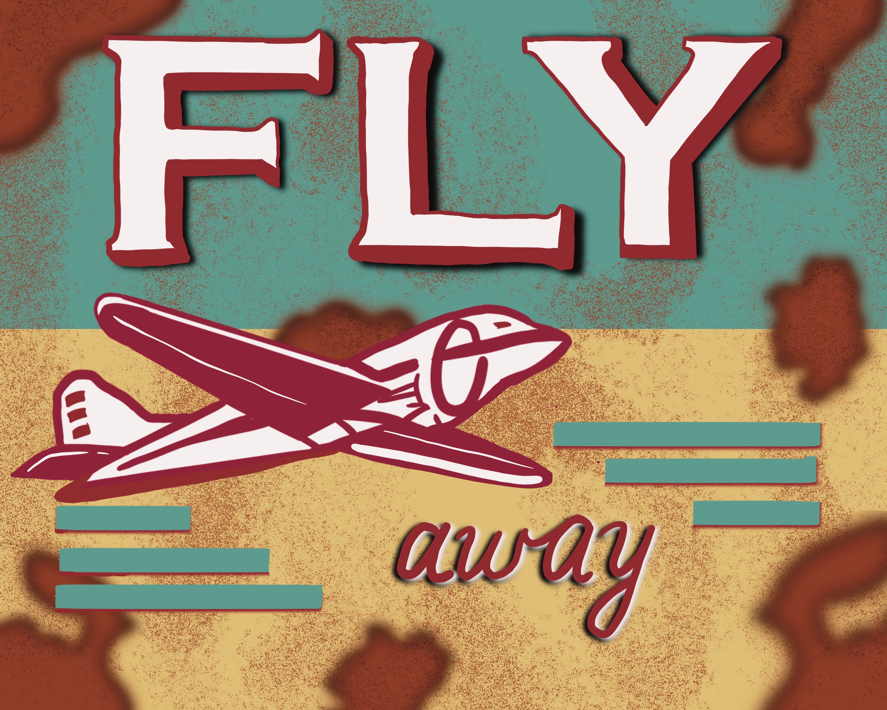


Project Name: Aviation Art Series
Date/Grade/Class: Fall 2023, Freelance
Size/Length: 8.5 by 11
Project Description: This series of six aviation-themed illustrations explores the nostalgia and mechanics of early-to-mid 20th-century aircraft through a stylized, retro design aesthetic. Each piece reflects a different aspect of flight, from vintage propaganda-style posters to technical representations of aircraft.
Flying Lessons Advertisement:
A playful vintage-inspired advertisement promoting flying lessons. With its humorous tagline, “$1 to fly, $50 to land,” this piece adds a whimsical touch to the series, blending humor with historical aviation references.
Fly Away:
A vibrant, vintage-style travel poster featuring an iconic airplane in mid-flight. The bold typography and retro color palette evoke a sense of adventure and freedom, reminiscent of the golden age of air travel.
Flying over the bridge:
A detailed close-up of an aircraft’s propeller engine, focusing on the beauty of mechanical design. The soft gradient of the sky contrasts with the rustic hues of the engine, offering a dynamic, almost intimate perspective of aviation technology.
Stormy Fighter:
A camouflaged fighter plane rendered in monochrome, flying against a dramatic cloudy sky. This piece reflects the intense atmosphere of military aviation, capturing the raw power of the aircraft as it navigates turbulent weather.
Jet Fighter Blueprint Illustration: This piece showcases a highly detailed blueprint of a modern fighter jet, highlighting its intricate design and technical complexity. The illustration features three distinct perspectives: front, top-down, and side views, allowing for a comprehensive visual understanding of the aircraft’s structure. The crisp white line work contrasts against a deep blue background, emphasizing the precision and mechanical sophistication of the jet. This piece would be ideal for a project focused on aerospace engineering, technical drawings, or military aviation. 2. Vintage Airplane
Over Scenic Landscape: A vibrant and stylized depiction of a vintage twin-propeller airplane soaring above a picturesque landscape. The illustration captures a sense of adventure and nostalgia, with the warm hues of the sky and bold colors accentuating the playful and whimsical nature of the piece. The serene mountain range and arched bridge below create a harmonious contrast, making it perfect for a travel-themed project or for evoking a sense of exploration and wanderlust. The use of thick outlines and simplified forms gives it a modern graphic design appeal, suitable for posters or editorial illustrations.
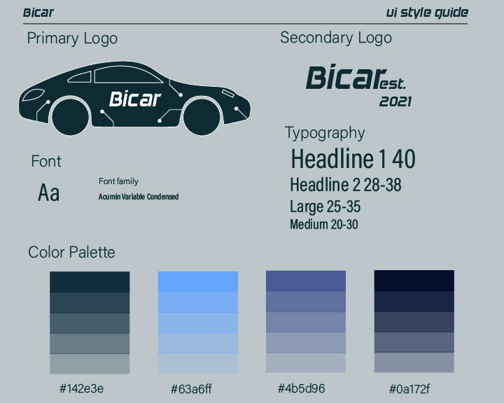
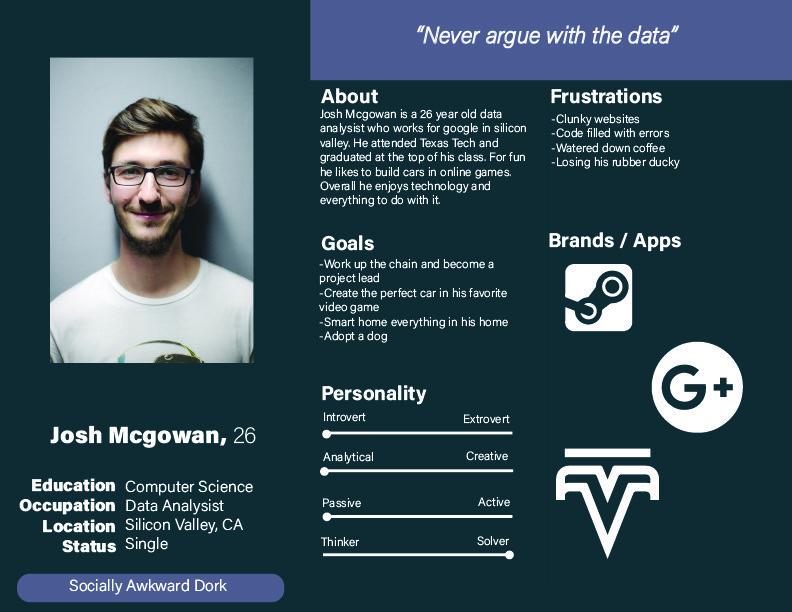
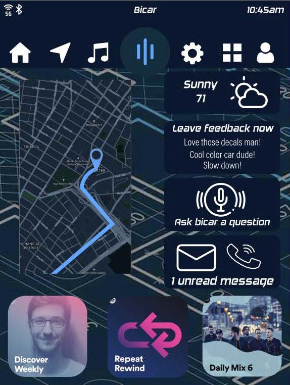
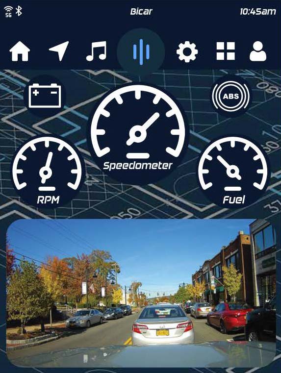
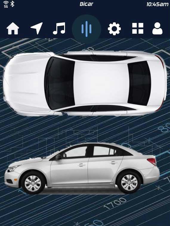
Project Name: Conceptual Interface Bicar
Date/Grade/Class: Spring 2021, Sophomore, Interactive media 2
Project Description: Design a conceptual interface of your choice. Experiment with unconventional ways of navigating the interface and representing the information needed to be communicated to the user.
UIUX Prototype Link: https://xd.adobe.com/view/e3d7737d-2de6-43c3-8743-f29c4f4a96bc-b684/
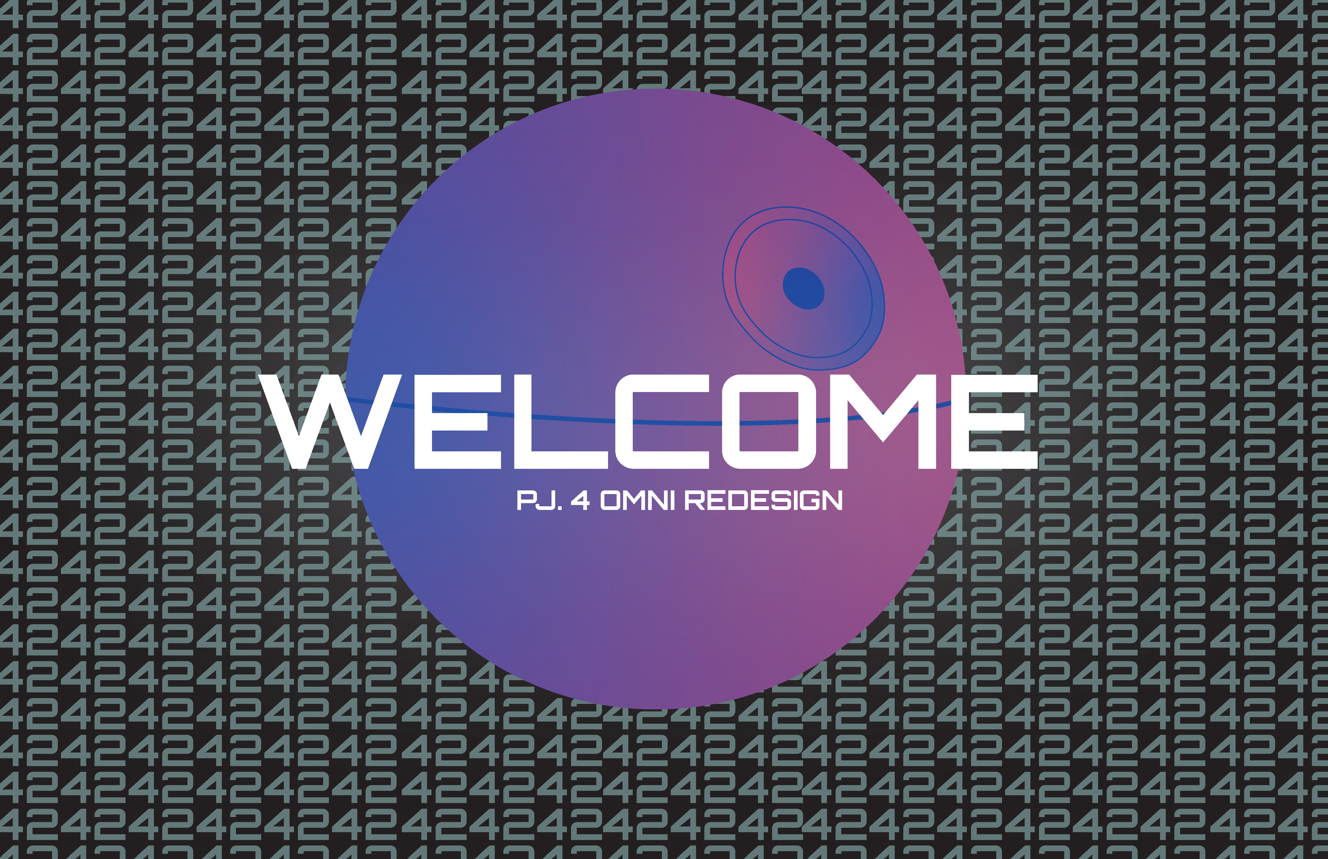
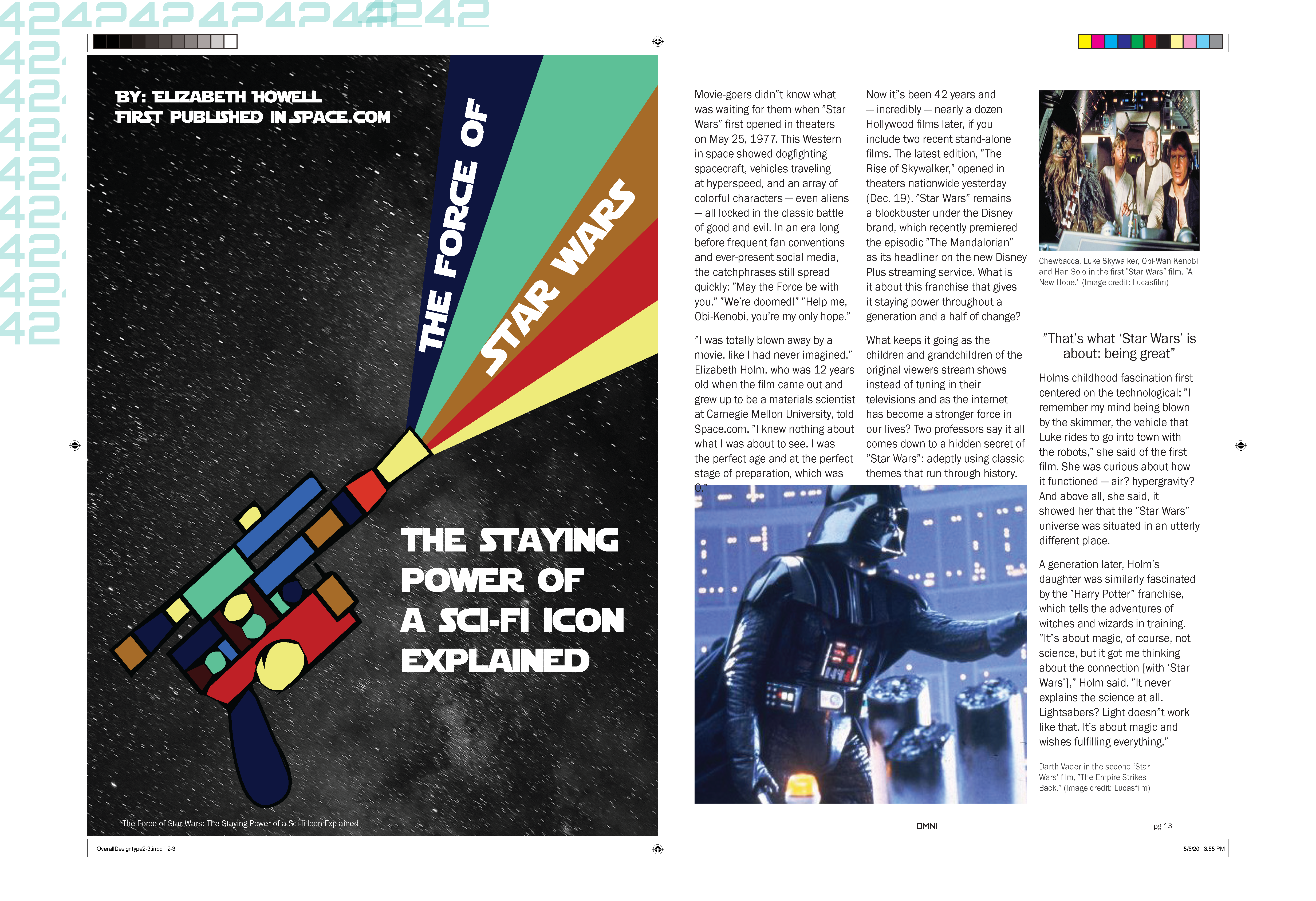

Project Name: Omni Magazine Redesign
Date/Grade/Class: Fall 2020, Sophomore, Typography 2
Size/Length: 8.5 by 11 spreads
Project Description: Work to redesign an existing magazine that is now defunct. The emphasis will be on exploring a customized use of typography as a competitive visual differentiator similar to Rolling Stone Magazine in the 1990s, designed by Fred Woodward and Gail Anderson.


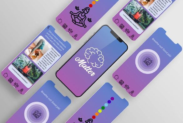

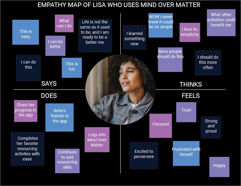
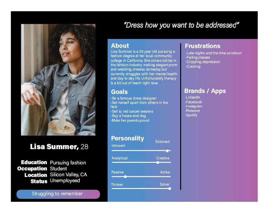
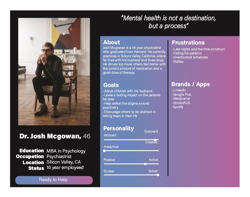
Project Name: Mobile Application Mind over Matter
Date/Grade/Class: Spring 2021, Sophomore, Interactive media 2
Project Description: Wireframe, prototype, and design i OS or Android mobile application that helps people understand and face social issues within the contemporary world. While designing the app, establish a visual design system for you to reference and utilize while building out the various functionalities.
UIUX Prototype Link: https://xd.adobe.com/view/68d88c02-67e7-44ae-9acc-4b75bc9abb7a-3d8b/
Project Name: Animated title sequenc
Date/Grade/Class: Fall 2020, Sophomore, Motion Design 2
Size/Length: 15 seconds
Project Description: Create a short title sequence for this project. The piece must include the main title card and two other standalone cards.
Thought process/Research: See preproduction
Project Name: Typography & Technology
Date/Grade/Class: Fall 2020, Sophomore, Typography 2
Size/Length: Several deliverables see images
Project Description: For this assignment, create content to promote a real-world museum exhibition or performance event.
Animated bumper: https://vimeo.com/407415332
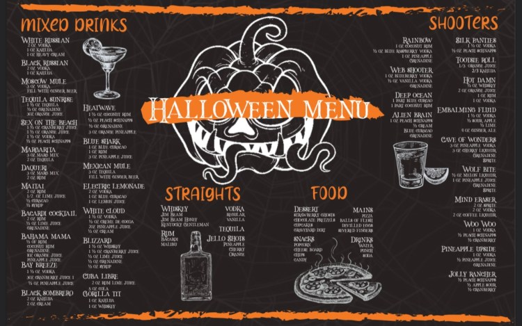
Project Name: Halloween menu
Date/Grade/Class: Fall 2022, Freelanced
Size/Length: 11 by 17
Project Description: Create a Halloween menu that catches the eyes of those attending the party while remaining legible and useful for those ordering food and drinks.

Project Name: Cartoon Network Broadcasting Rebranding
Date/Grade/Class: Fall 2020, Sophomore, Motion Design 2
Size/Length: 30 seconds
Project Description: Rebrand a Television show, News program, Award Show, or Sports Network Identity package.
Thought process/Research: See preproduction
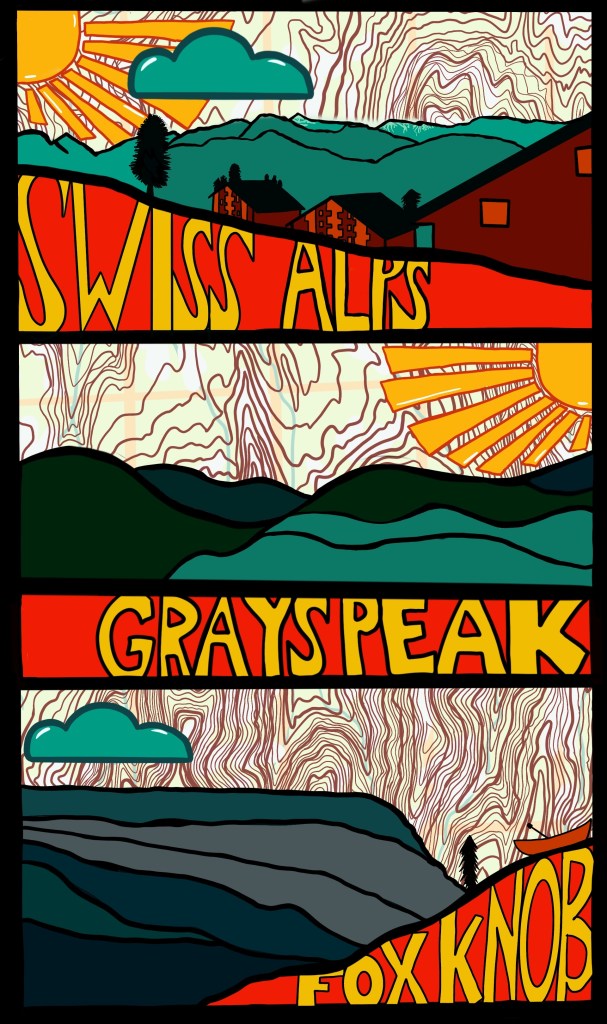
Project Name: Triptych
Date/Grade/Class: Fall 2019, Freshman, Introduction to Design
Size/Length: 1920px by 1080px
Project Description: Using Adobe Photoshop and/or Illustrator, conceptualize a series of panels that will be used as a three-part large outdoor billboard. The panels should each work independently but also side-by-side. Start by conceptualizing 3 separate panels (and the environment in which they might exist)– a cohesive triptych — that exhibit your understanding of the concepts of (1) framing, (2) hierarchy, and (3) layering.
Thought process/Research:
G- The goal is to create an old postcard feel to apply on a billboard to then place in an airport so that people
get the idea of a travel ad.
A- Anyone in an airport, whether traveling, working or picking someone up.
C-The concept of this is to advertise travel to different places to people interested in nature/ mountains.
M- The main message is that lots of places have beautiful nature and that you don’t have to go somewhere
far, expensive, or very tourist to enjoy the beauty of nature.
I-The images include nature, places that have beautiful nature, mountains, etc.
S-The style is old but new. The colors are retro-based, like teal, maroon, mustard, yellow, and orange. It uses geometric outlines and shapes so that it isn’t hard to see in passing.
T-The theme of this poster is somewhat like “good life” brands. Color-matched with Nature without extreme detail.
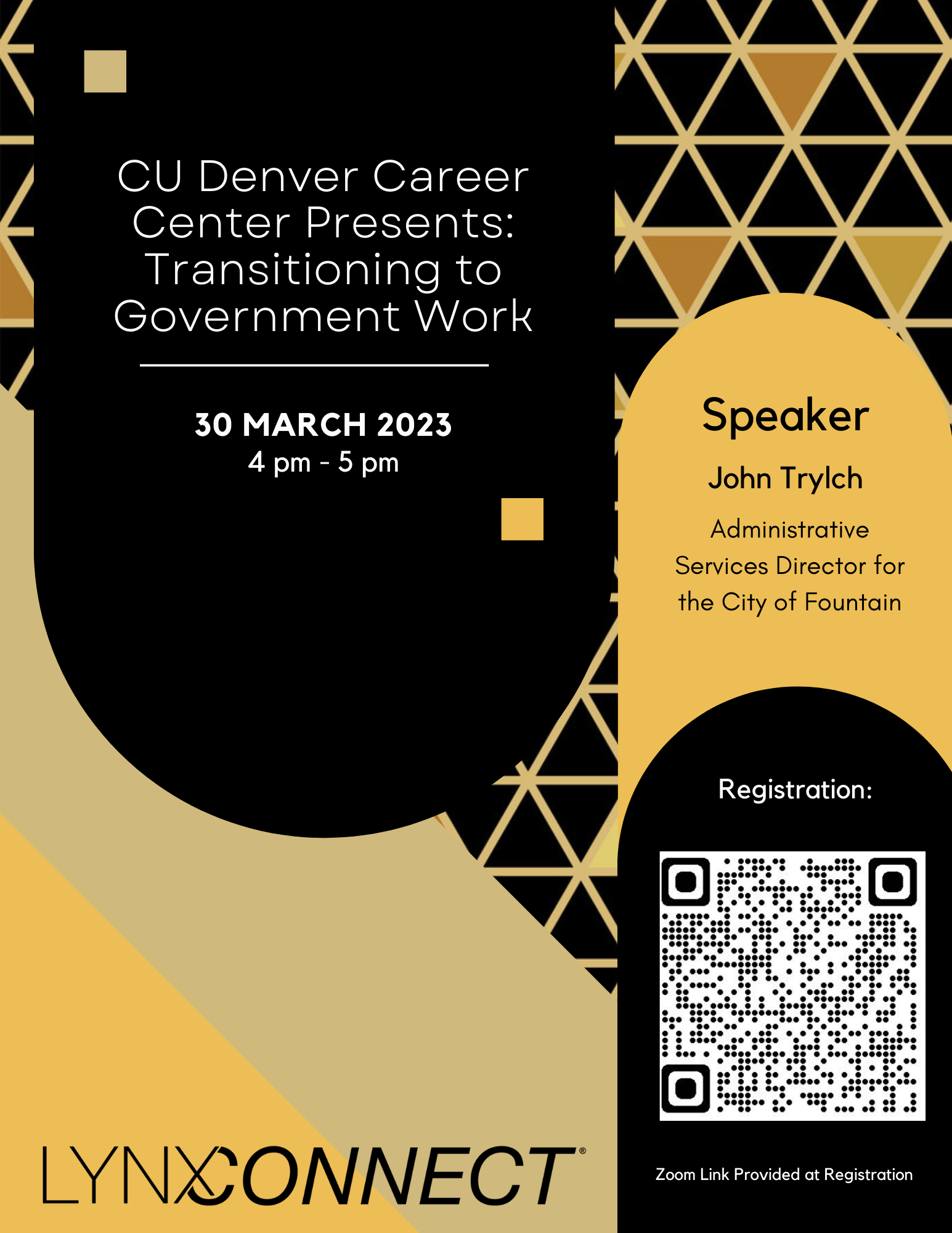
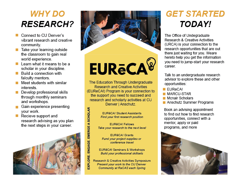

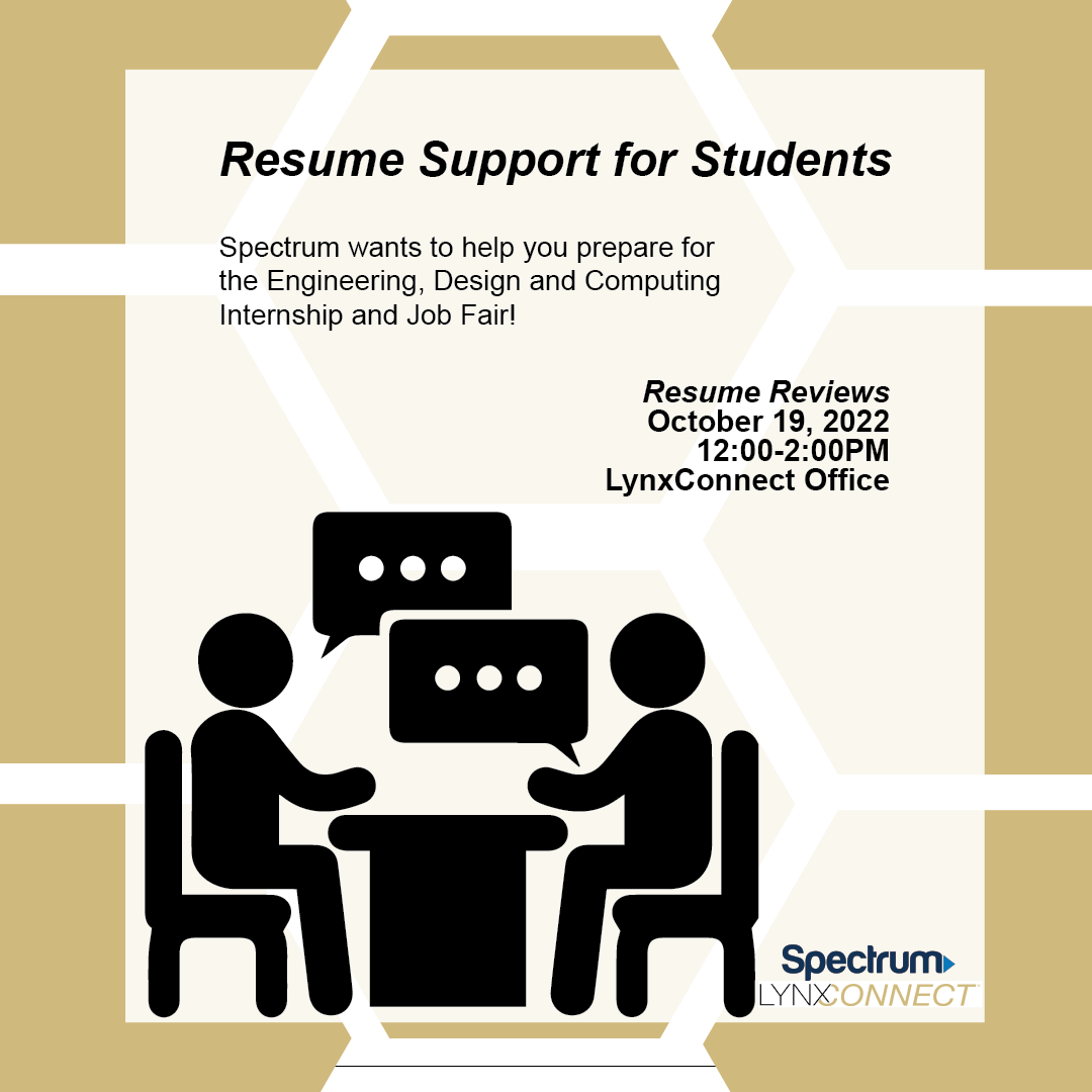


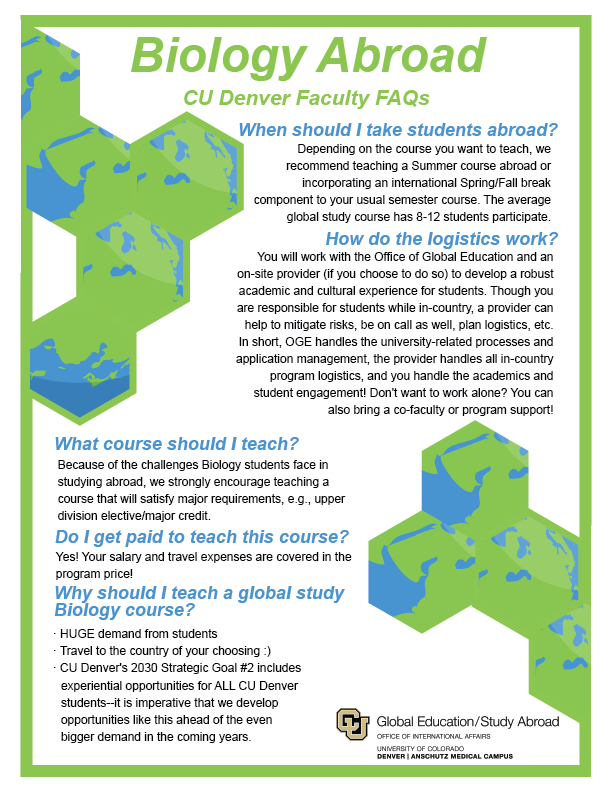
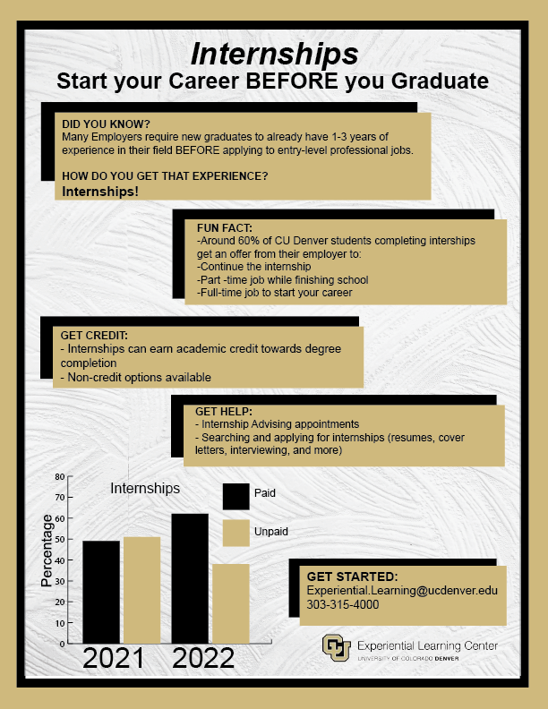
Project Name: Print Collateral for upcoming Workshops through LynxConnect
Date/Grade/Class: Summer 2022 – Spring 2023, Work
Size/Length: varies
Project Description: Details vary, but these are used to get information out to students about events planned to help benefit them in resume writing, job applications, job interviews, scholarships, and studying abroad.
